
Let’s face it, CSS can sometimes feel like wrestling a particularly stubborn octopus. One minute you’re confidently styling your webpage, the next, everything’s gone haywire, and you’re left wondering where it all went wrong. Fear not, dear reader, because today, we’re going to tackle one of the most fundamental concepts in CSS: the Box Model. Don’t worry, I promise to keep it light, humorous, and educational, so you’ll be a box model maestro in no time!
What’s in the Box?!
Imagine every element on your webpage as a beautifully wrapped present. The content, the actual text or image, is the gift inside. Surrounding the gift is a layer of padding, like the soft tissue paper protecting it. Next comes the border, the fancy wrapping paper adding that touch of elegance. And finally, the margin, the space around the present, ensuring it doesn’t get squished against other gifts. That, in a nutshell, is the CSS box model!
Breaking it Down:
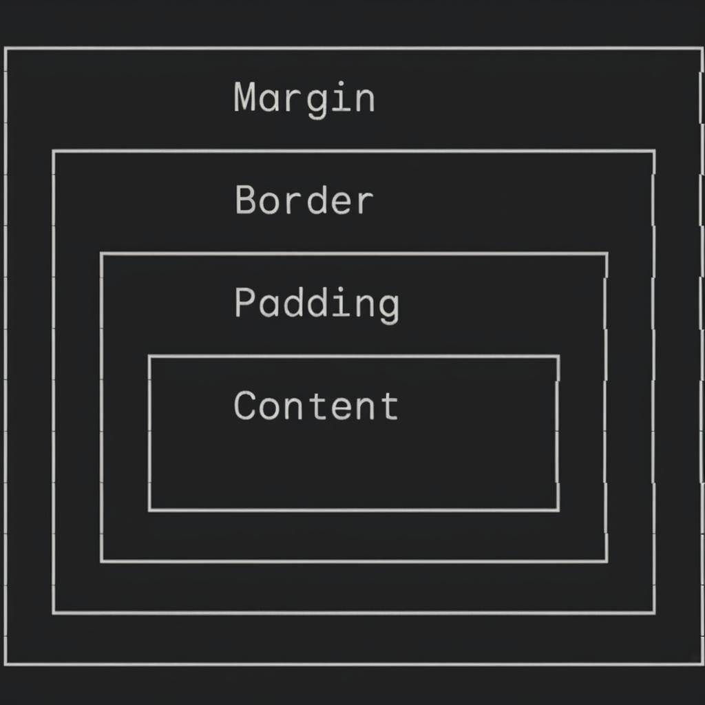
- Content: This is the heart of your element, the actual text, image, or other media you want to display. The
widthandheightproperties control the size of the content area itself. - Padding: Think of this as the element’s personal space bubble. It’s the transparent area between the content and the border. You can control the padding on all four sides using
padding-top,padding-right,padding-bottom, andpadding-left, or use the shorthandpaddingproperty for convenience. - Border: This is the visible outline surrounding your element. You can customize its style (solid, dashed, dotted), color, and width using properties like
border-style,border-color, andborder-width. Again, shorthand properties likeborderandborder-topcan save you some typing. - Margin: This is the space outside the border, separating your element from its neighbors. Like padding, you can control margins on all sides individually or use the
marginshorthand. Margins can also be set toautoto center an element horizontally within its container.
The box-sizing Property: Your New Best Friend
By default, the width and height properties only apply to the content area. This means that adding padding and border will increase the overall size of the element, which can lead to unexpected layout issues. Enter the box-sizing property!
Setting box-sizing: border-box; tells the browser to include padding and border in the total width and height of the element. This makes calculations much more predictable and can save you a lot of headaches. Trust me, it’s a game-changer!
A Few Tips and Tricks:
- Collapsing Margins: When two elements’ margins touch, they sometimes combine into a single margin. This behavior can be a bit tricky, but understanding it is crucial for controlling vertical spacing.
- Overflow: If the content of an element is larger than its specified dimensions, you can use the
overflowproperty to control how the extra content is handled. Options include hiding it, showing scrollbars, or letting it spill out of the container. display: inline-block;: This handy property allows you to control the width and height of inline elements (like<span>) while still letting them flow alongside other content. It’s a great tool for creating flexible layouts.
Wrapping it Up
The CSS box model may seem a bit daunting at first, but once you grasp its core concepts, you’ll have a powerful tool for creating beautiful and responsive web layouts. Remember, every element is a box, and understanding how those boxes interact is the key to mastering CSS.
Now go forth and create some amazing webpages! And don’t forget to share your box model triumphs (or tribulations!) in the comments below. Let’s learn and grow together!
P.S. If you’re hungry for more CSS knowledge, check out these resources: