If Fauvism had a “good vibes only” department, Raoul Dufy would have been the manager, the assistant manager, and the guy handing out complimentary lemonade at the door.
Dufy shows up in art history right when painters are arguing (again) about what painting is “supposed” to do. Some artists are wrestling with the universe. Some are wrestling with their childhood. Dufy looks at all that, nods politely, and goes, “Cool. Anyway, here are boats.”
And not just any boats.
Boats that look like they have theme music.
Who is this artist?
Raoul Dufy (1877–1953) was a French painter and designer who built a career out of bright color, breezy lines, and scenes where everyone looks like they have nowhere urgent to be. Think regattas, concerts, promenades, casinos, and seaside towns that feel permanently scheduled for a long weekend. Britannica bio
He also designed textiles, illustrations, and decorative work, which makes total sense because his paintings often feel like they want to leap off the canvas and become a scarf.
What is he known for?
Dufy is known for joyful, decorative scenes with:
- Light-as-a-mood color
- Calligraphic outlines that glide more than they describe
- A white ground showing through like the painting is breathing
- Crowds and celebrations without the sticky reality of crowds and celebrations
He’s basically the rare painter who can depict “a lot happening” while still making your brain unclench.
What is his style?
Early on, he moves through Impressionist influence, then gets hit with the Fauvist lightning bolt (hello, wild color), and later flirts with structure and simplified geometry.
But the “Dufy thing” people remember is the mature look: loose ink-like lines + thin, luminous color washes that don’t always stay inside the lines, because they don’t have to. It’s not sloppy. It’s confident. Like someone who knows the rules and is bored by them.
There’s a reason so many people describe his work as having joie de vivre without making it sound like a scented candle. Te Papa overview
Who taught him?
Dufy didn’t hatch fully formed from a pastel rainbow.
He studied in Le Havre first, then trained in Paris at the Ecole des Beaux-Arts. Early on, he was influenced by the big currents around him, and he becomes closely connected to artists in the Fauvist orbit.
He also formed important friendships with other painters from Le Havre, including Othon Friesz, and crossed paths in the same scene as Georges Braque.
Translation: he learned in the real way artists learn. School, yes. But also: watching, absorbing, reacting, and stealing good ideas like a professional.
Does he use any special technique?
Yes. Dufy’s “special technique” is making painting look effortless while quietly being very intentional.
His classic approach is:
- Draw the structure with lively line (often like pen or ink energy)
- Lay in color as thin washes (watercolor/gouache vibes even in oil)
- Let white ground sparkle through
- Refuse to over-explain anything
He’s not trying to trap reality. He’s trying to suggest it, the way a great song suggests a feeling without listing every detail of the singer’s day.
Who has he worked with?
Dufy wasn’t just a gallery painter. He worked across fine art and design, including textile and decorative commissions.
And then there’s the big one.
In 1937, he created a monumental mural celebrating electricity for the Paris International Exposition. It’s enormous, celebratory, and unapologetically ambitious, like the world’s fanciest science poster. Musee d’Art Moderne de Paris: La Fee Electricite
If you’ve ever looked at modern life and thought, “This needs more color and less dread,” Dufy was already on it.
Was he wealthy?
He did well enough to become widely collected and respected, especially as his style became instantly recognizable and highly decorative (which, in the art world, is either a compliment or a crime depending on who’s talking).
He also had steady work through design and commissions, which is basically the artistic equivalent of having multiple income streams without having to start a podcast about it.
When was he most popular?
He rose with the early 1900s avant-garde energy, but his popularity really solidified as his mature style became unmistakable and widely appreciated. Decorative modernism has a funny way of staying welcome, because people like living with art that doesn’t scold them.
And that 1937 mural commission? That’s the kind of assignment you don’t get unless you’re already “the person for this.”
Tell me more, please
Here’s the secret sauce: Dufy is a master of pleasant complexity.
He paints busy scenes (races, concerts, sailing events) but the result feels light, not chaotic. That’s hard. Most people can do “busy and stressful.” Dufy does “busy and breezy.”
Also, his line work has this elegant shorthand quality. He can imply a violinist, a sail, a building, a crowd, and an entire afternoon vibe with a handful of strokes. It’s like watching someone sign their name beautifully and realizing you’ve been writing yours like a tired squirrel.
Anything else left to tell?
One of the most charming things about Dufy is that his work doesn’t apologize for being enjoyable.
A lot of art wants to prove it’s important. Dufy just is.
He paints pleasure, leisure, and spectacle, not because he’s unaware of life’s darker parts, but because he’s choosing to spotlight what feels buoyant.
If your brain has been running on “serious mode” lately, Dufy is permission to exhale.
Any other interesting tidbits?
- He worked in multiple media and contexts, from fine art to design, which helped him develop that bold, graphic clarity.
- His big mural work shows he could scale up without losing his signature lightness.
- His visual language is so distinct that once you recognize it, you start spotting “Dufy energy” in modern illustration and pattern design everywhere.
And yes: if you’re the kind of person who sees a yacht race and thinks, “This could use more electric blue,” you might be one of his people.
If you enjoyed this one, follow along for the next episode and drop a comment with your pick: team regattas, team concerts, or team glamorous seaside stroll?
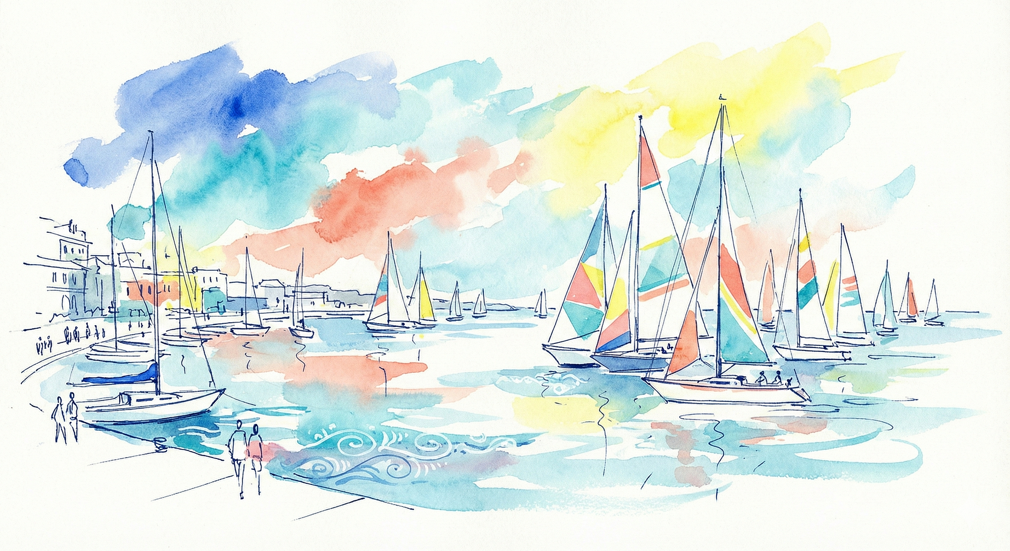
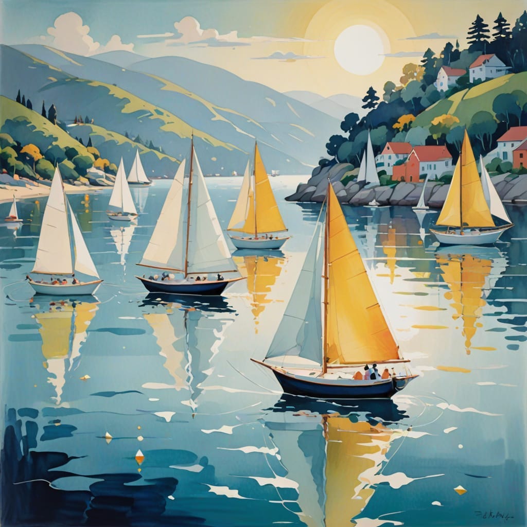
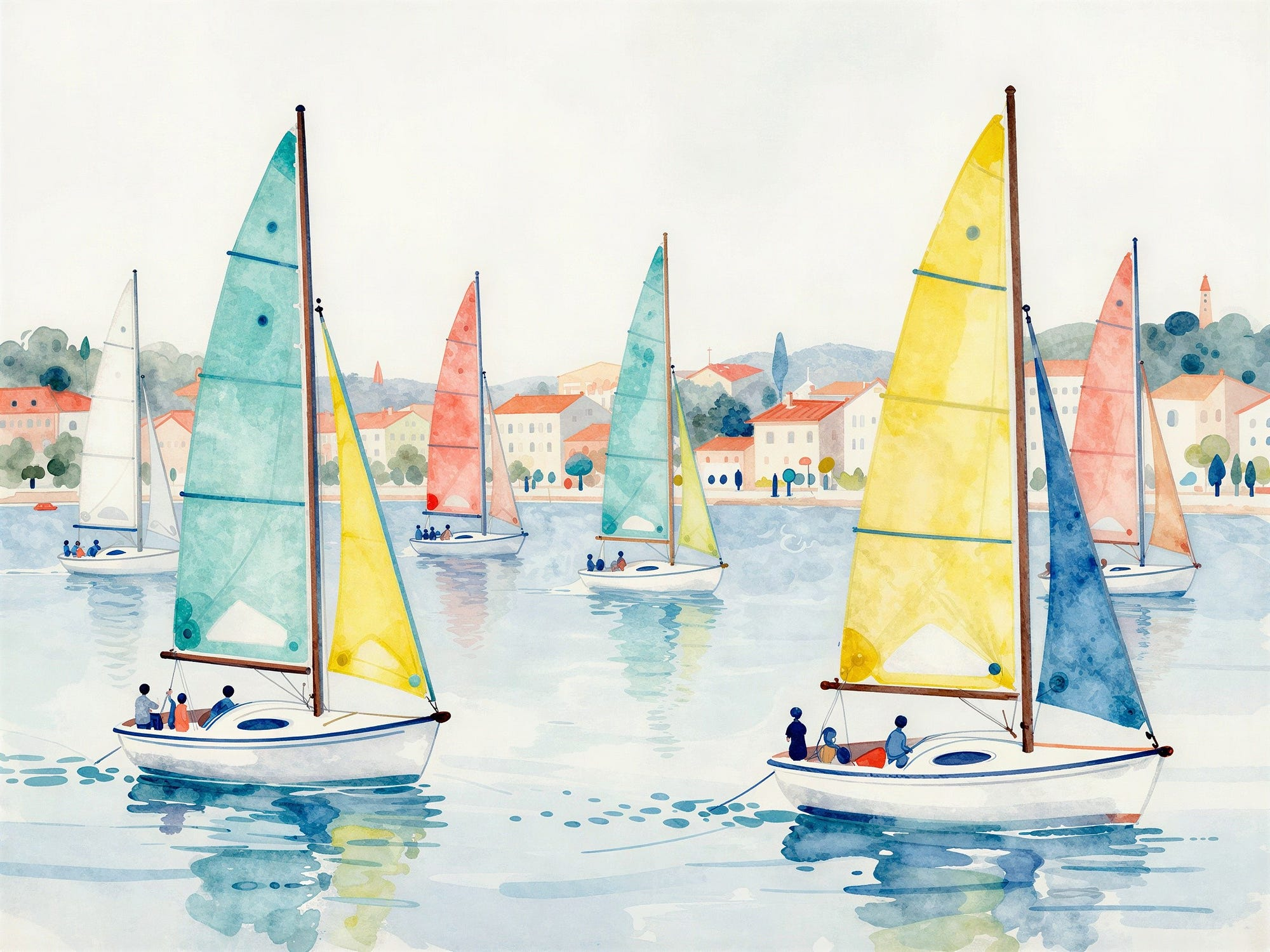
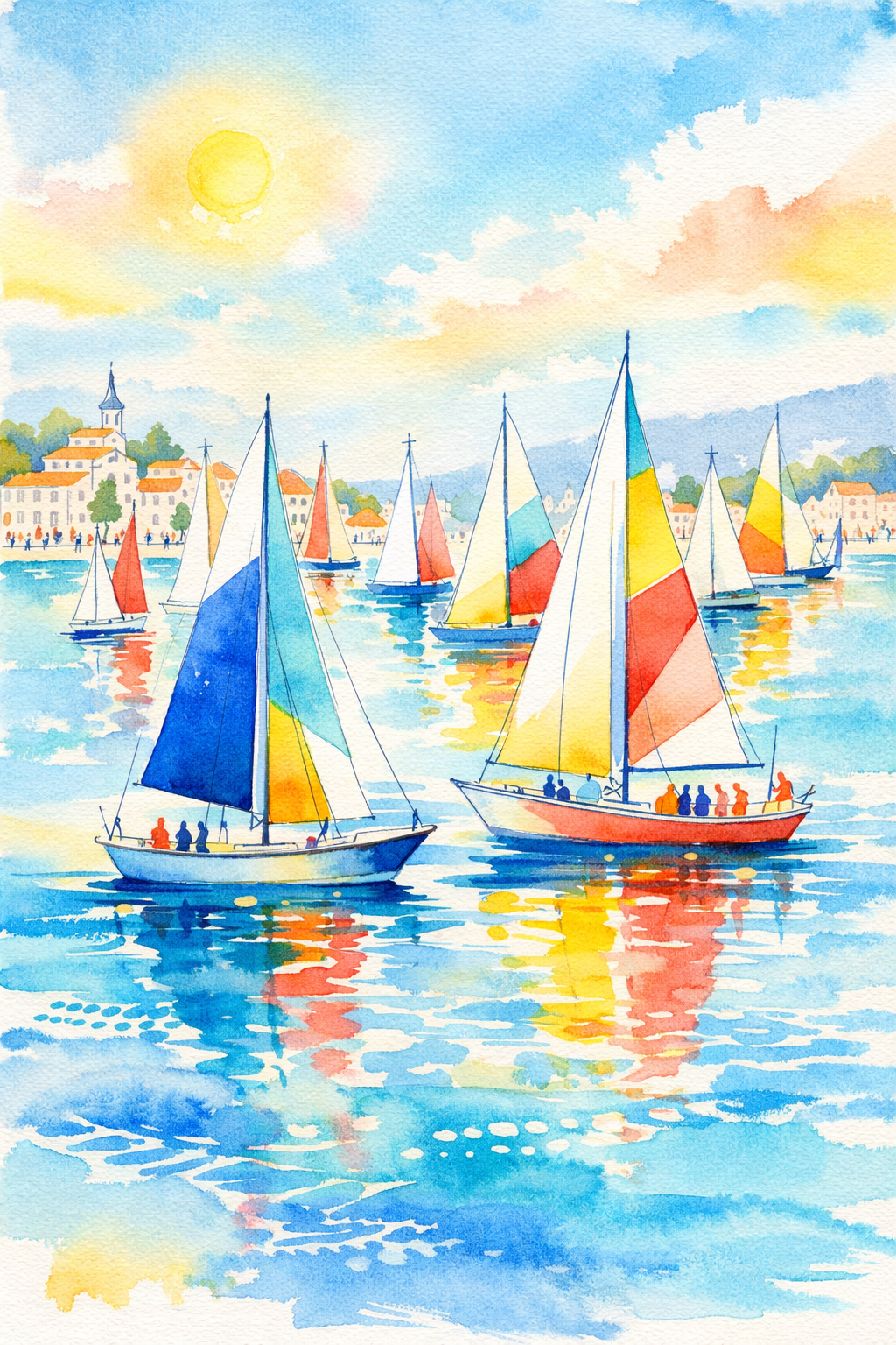
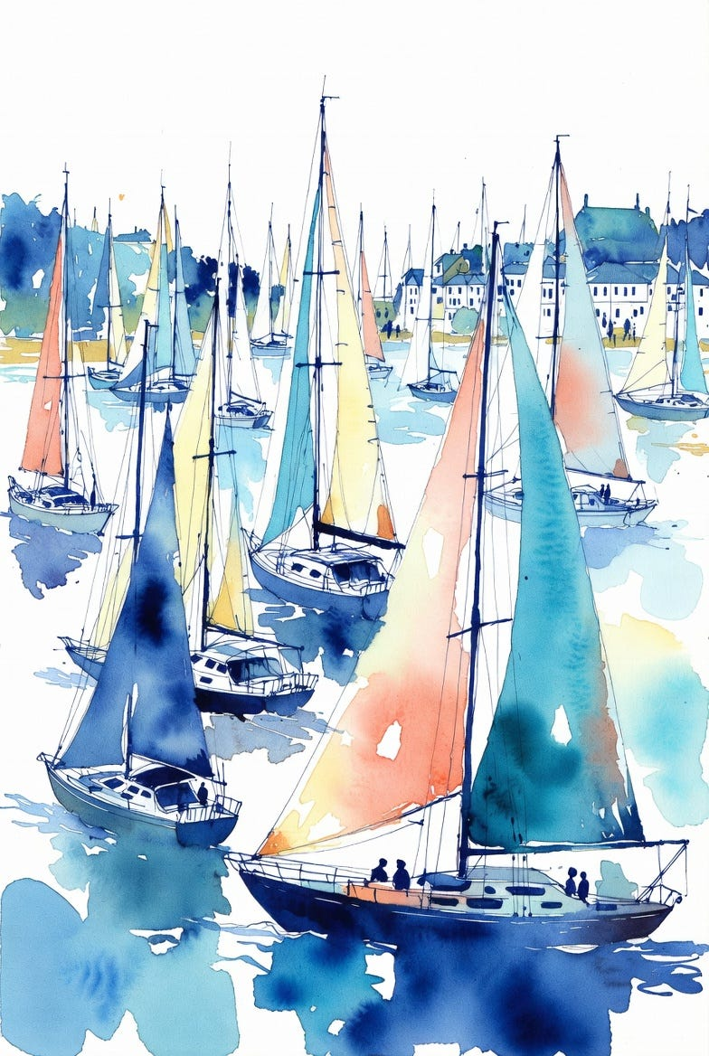
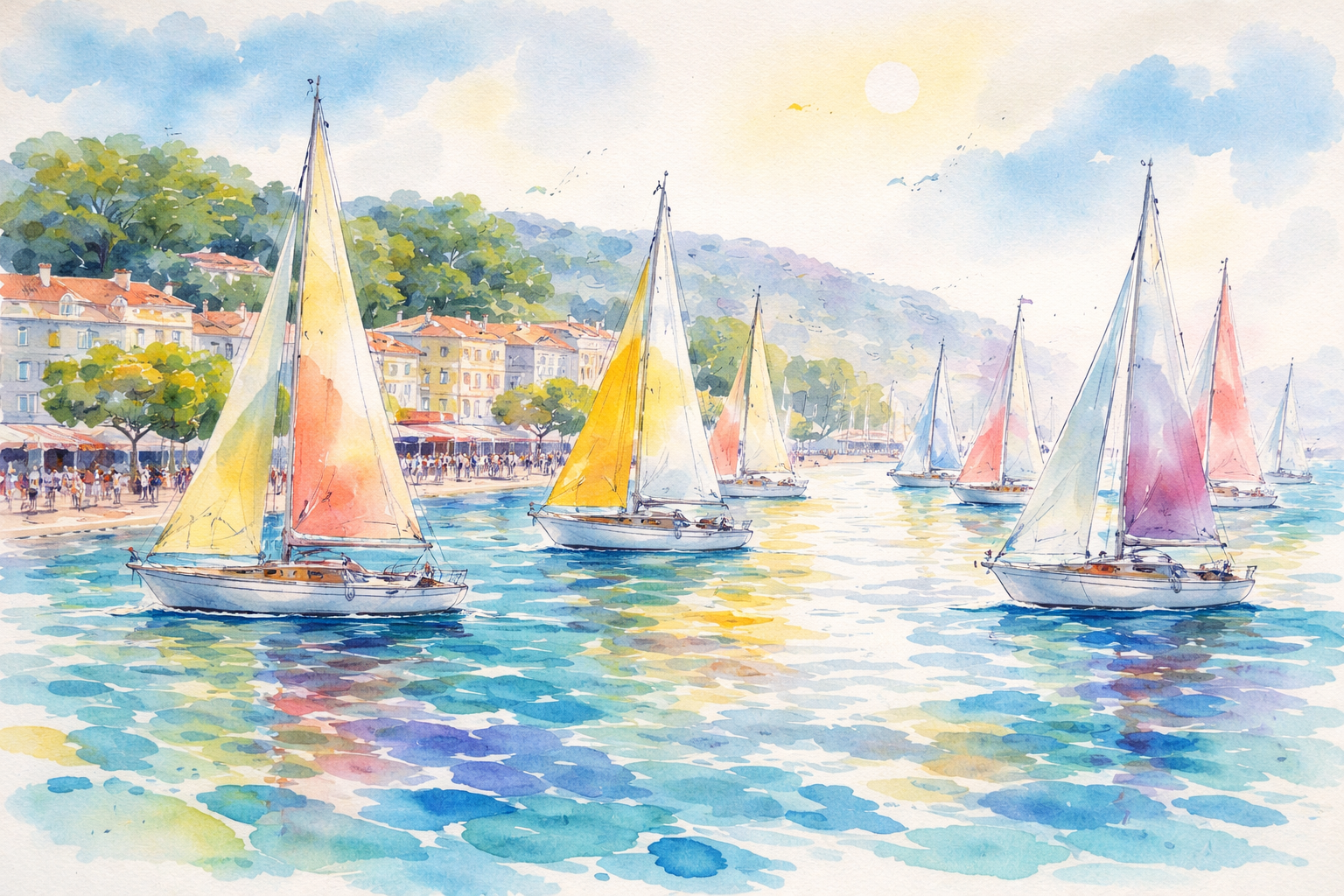
Art Prompt (Decorative watercolor): A luminous seaside regatta scene painted with airy, translucent washes of cobalt, turquoise, coral, and lemon yellow over a bright white ground. Elegant sailboats cluster across a calm bay, their sails rendered as simplified geometric shapes with playful color accents. Fine, calligraphic navy lines sketch the masts, rigging, shoreline buildings, and tiny figures in breezy shorthand, leaving deliberate gaps where white paper glows through. The composition feels festive and weightless, with a gently flattened perspective, decorative patterns in the water, and a sunlit atmosphere that radiates joy and motion without heavy shadows. Crisp edges meet loose color blooms, creating a sophisticated, modern, celebratory mood.
Video Prompt: Animate a luminous seaside regatta scene in airy watercolor washes over a bright white ground. Start with a slow push-in across shimmering patterned water as sailboats glide smoothly left to right; sails gently billow and subtly change hue between cobalt, turquoise, coral, and lemon. Calligraphic navy lines draw themselves on-screen to reveal masts, rigging, shoreline buildings, and tiny figures, like elegant ink strokes appearing in real time. Add sparkling light flickers where white paper shows through, with soft watercolor blooms spreading and settling. Include quick rhythmic cuts: a sail catching wind, flags fluttering, reflections rippling, confetti-like color accents popping and fading. End on a wide, festive panorama with a bright sunlit glow and a satisfying final ink flourish that completes the shoreline.
For the soundtrack, try:
- A Walk — Tycho
- Odessa — Caribou