Some artists whisper.
Barbara Kruger walks into the room, points at the wallpaper of modern life, and says, “You really going to just let that happen?”
And the unnerving part is: she is usually right.
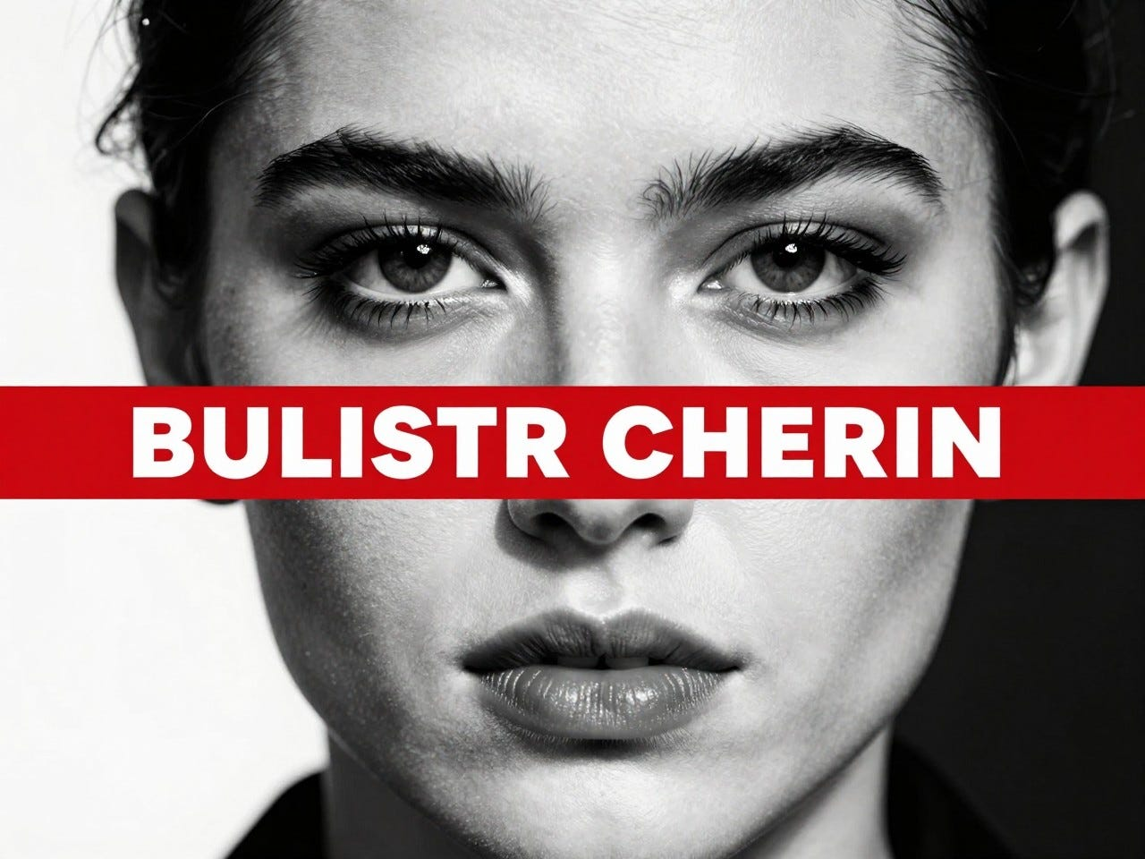
Kruger is one of those artists whose work feels less like a polite museum object and more like a verbal ambush delivered with terrifying graphic design skills. You see a black-and-white image, a slab of red, a few words in bold white type, and suddenly your brain is being cross-examined about shopping, power, gender, media, authority, desire, and why advertisements somehow know more about your insecurities than your closest relatives.
It is art, yes.
It is also a very stylish public interrogation.
Who is this artist?
Barbara Kruger is an American conceptual artist born in Newark, New Jersey, in 1945. She is associated with conceptual art, typography, graphic design, installation, and the broader Pictures Generation orbit, which is art-history language for “a bunch of sharp people who realized images were already running the world and decided to fight back using the same weapons.” If you want a clean overview of her life and work, Britannica has a solid biography here.
She did not emerge from some misty little attic where she painted by candlelight while nobly starving beside a crust of bread. Quite the opposite. Her path ran straight through design, magazines, editorial culture, and the machinery of mass communication. Which turns out to be perfect training if your future career involves hijacking the visual language of persuasion and sending it back into the culture wearing steel-toed boots.
What is she known for?
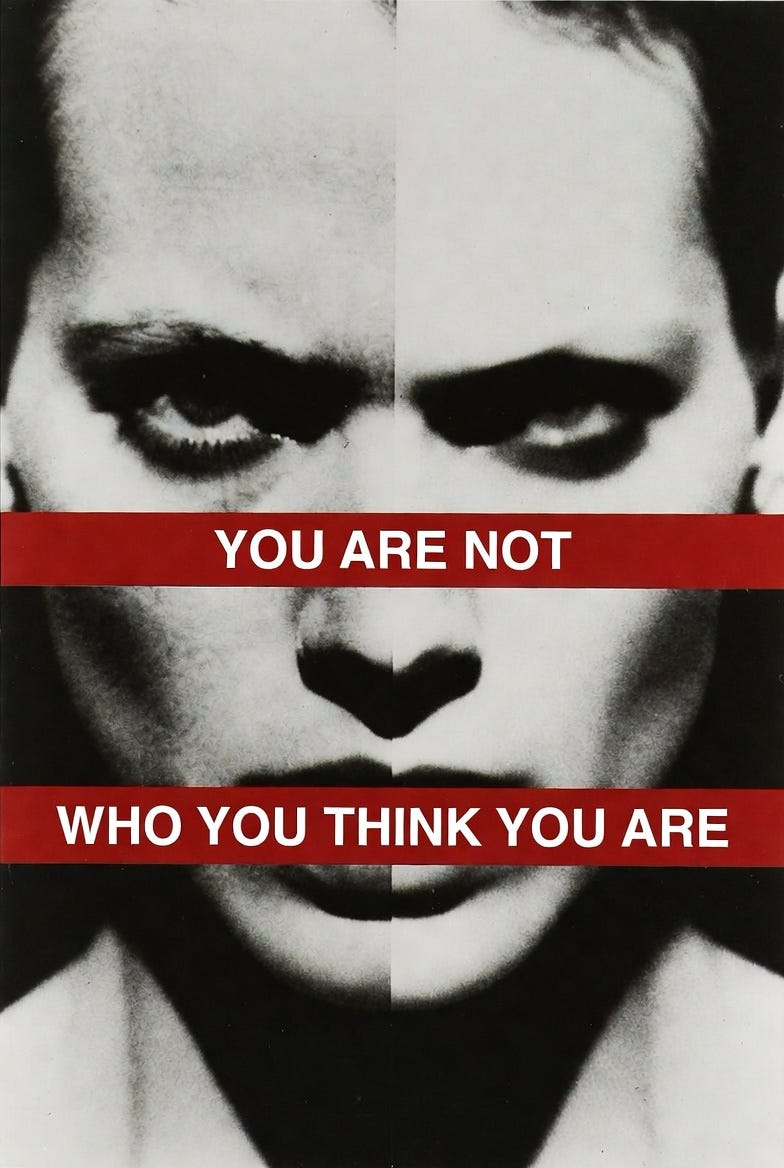
Kruger is best known for photo-based works that combine found or staged black-and-white imagery with short, confrontational text. The text is usually set in bold white letters on red bars, and it lands with all the softness of a courtroom objection.
She is especially known for works like Untitled (I shop therefore I am) and Untitled (Your body is a battleground), the latter of which was created for the 1989 Women’s March on Washington in support of reproductive freedom. The piece still hits like a brick through a department store window because it understands something uncomfortable: power loves a slogan, and slogans love getting inside your head. The Broad’s page on that work lays out the context clearly and confirms how tightly her art merges protest, media language, and public confrontation: The Broad — Untitled (Your body is a battleground).
What is her style?
Her style is conceptual, graphic, blunt, funny, and often deliciously accusatory.
Kruger takes the visual grammar of advertising, magazines, tabloids, propaganda, and public signage and repurposes it. She does not merely use text in images. She uses text the way some artists use a knife: precisely, dramatically, and with no patience for nonsense.
MoMA’s artist page usefully places her among conceptual art, graphic design, installation, typography, and vernacular photography, which is a tidy institutional way of saying she is extremely good at making everyday image culture confess its sins: MoMA — Barbara Kruger.
A lot of her works lean on pronouns like you, I, we, and they. That is not accidental. Pronouns are tiny words with giant consequences. They let Kruger drag you into the frame whether you volunteered or not. You are not just looking at the work. The work is looking back and wondering what exactly you have been agreeing to all these years.
Who taught her?
Kruger briefly attended Syracuse University, then studied at Parsons School of Design in New York City, where she learned from Marvin Israel and Diane Arbus. That is a wildly strong artistic pedigree and also a clue to why her work understands image-making so deeply. The Broad notes both teachers directly, and also points out that she moved into graphic design work at Condé Nast’s Mademoiselle, becoming head designer at twenty-two, which is the sort of sentence that makes the rest of us want to go lie down for a minute: The Broad — Barbara Kruger bio.
Does she use any special technique?
Oh yes, and the special technique is basically: “borrow the language of persuasion, then expose the trick while it is still mid-performance.”
Before digital layout became frictionless and soulless in its own special way, magazine designers physically assembled paste-ups from photos, captions, headlines, and blocks of type. The National Gallery of Art explains that Kruger came out of exactly that world, and that her art riffs on those editorial methods to expose power dynamics in politics, culture, and private life. That background matters because her work does not merely look designed. It thinks like design and then misbehaves on purpose: National Gallery of Art — Women and Art.
So yes, the special technique includes montage, appropriation, graphic contrast, slogan logic, scale, site-specific installation, and the deeply unfair ability to make six words feel like they have subpoena power.
Who has she worked with?
Kruger is not really a “paint in a meadow with pals” kind of artist. Her collaborations tend to happen across institutions, media systems, and public space.
She has worked in magazine publishing, taught across major universities, exhibited widely, and collaborated with the design firm Project Projects to remake the visual identity of Performa 17. That project blurred branding, performance, public art, commerce, and critique so thoroughly that it basically felt like a Barbara Kruger thesis statement wearing event graphics: Performa Archive — Barbara Kruger.
She is also often discussed alongside artists in the Pictures Generation and adjacent feminist and postmodern circles, but Kruger always feels slightly more likely than most of her peers to pin the culture to the wall with its own catchphrases.
Was she wealthy?
She did not come from old-money grandeur or velvet-chaise-lounge art-movie excess. The Smithsonian American Art Museum notes that she was the only child in a lower-middle-class family. So no, this was not one of those “summering in Europe before discovering collage” situations: Smithsonian American Art Museum — Barbara Kruger.
Later, of course, she became highly successful and internationally recognized. But the origin story is not aristocratic bohemia. It is much more grounded, which honestly suits her. Her work has always seemed suspicious of polished authority, and perhaps that suspicion had a very practical beginning.
When was she most popular?
Her major breakthrough came in the 1980s, when her image-text works became central to conversations about feminism, consumer culture, media critique, and postmodern art. That was the decade when her visual language became unmistakable and unavoidable.
But she is not one of those artists who had one hot decade and then drifted off into tasteful footnote territory. MoMA mounted the large-scale exhibition Thinking of You. I Mean Me. I Mean You. in 2022–2023, which is a pretty good sign that her work still has plenty of voltage. In fact, she may be even more relevant now, because we currently live inside an infinite scroll of weaponized language, algorithmic persuasion, and emotional branding. Barbara Kruger looked at that future early and basically said, “Yes, this will become exhausting.”
Tell me more, please
One of the smartest things about Kruger is that she never let “political art” become boring homework.
Her work is sharp, but it is also funny in a dry, devastating way. It understands melodrama, seduction, spectacle, vanity, panic, self-help language, tabloid tone, luxury aspiration, moralizing language, and the strange voice authority uses when it is pretending to be your friend.
That is why the work ages so well. She was not just critiquing a few ads or a few headlines. She was looking at the structure beneath them. She understood that modern culture runs on commands dressed as choices.
Buy. Obey. Desire. Improve. Submit. Perform. Consume. Smile about it.
Kruger does not peel that machinery apart delicately. She slaps the casing and makes you hear the rattling.
Anything else left to tell?
Yes: Barbara Kruger is one of the rare artists who can thrive at the scale of a poster, a wall, a museum atrium, a billboard, a skate park, a bus card, a magazine page, or a public intervention without losing force.
That flexibility matters. Some artists need the sacred hush of the gallery to function. Kruger can work there, sure, but she is equally happy invading the same public and commercial spaces that manufacture belief in the first place. Her art does not merely survive outside the museum. It becomes even ruder there, which is excellent.
She also helped prove that graphic design, editorial language, and visual culture were not lesser materials for art. They were the battlefield. She just showed up earlier than most with better typography.
Any other interesting tidbits?
A funny and very Barbara Kruger-ish footnote to her legacy is that her aesthetic became so influential that later brands and visual cultures started looking suspiciously like they owed her rent.
That is the risk of inventing a look that is both iconic and adaptable: sooner or later the culture starts stealing from the person who was originally criticizing the culture for stealing your attention.
Which, frankly, feels like a Barbara Kruger artwork that escaped into real life.
If you enjoyed this episode, follow along for more Artist Series dives and drop a comment with your favorite Kruger line, work, or cultural truth-bomb. If a piece of art has ever made you laugh first and then feel mildly indicted a second later, this is your crowd.
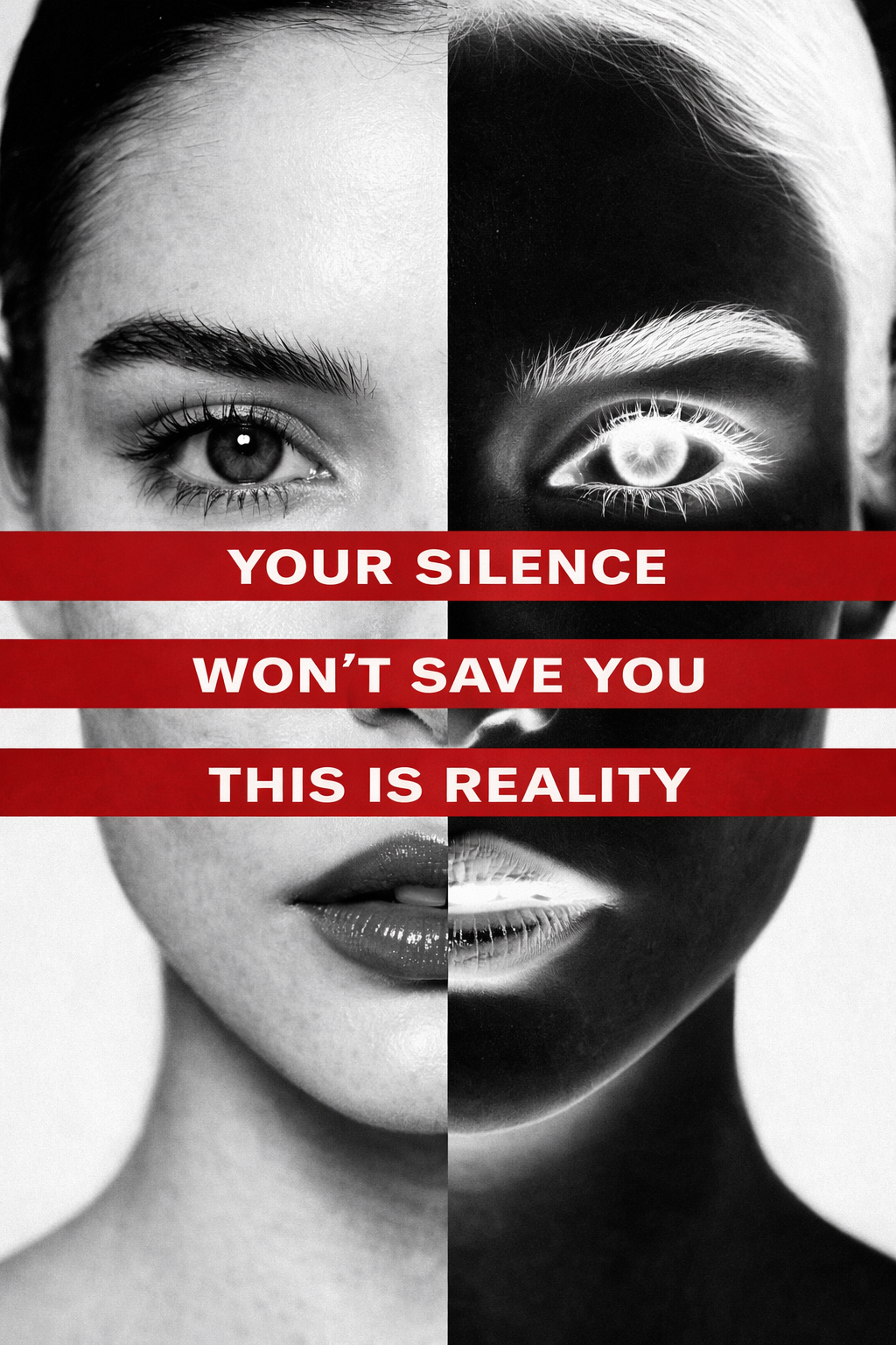
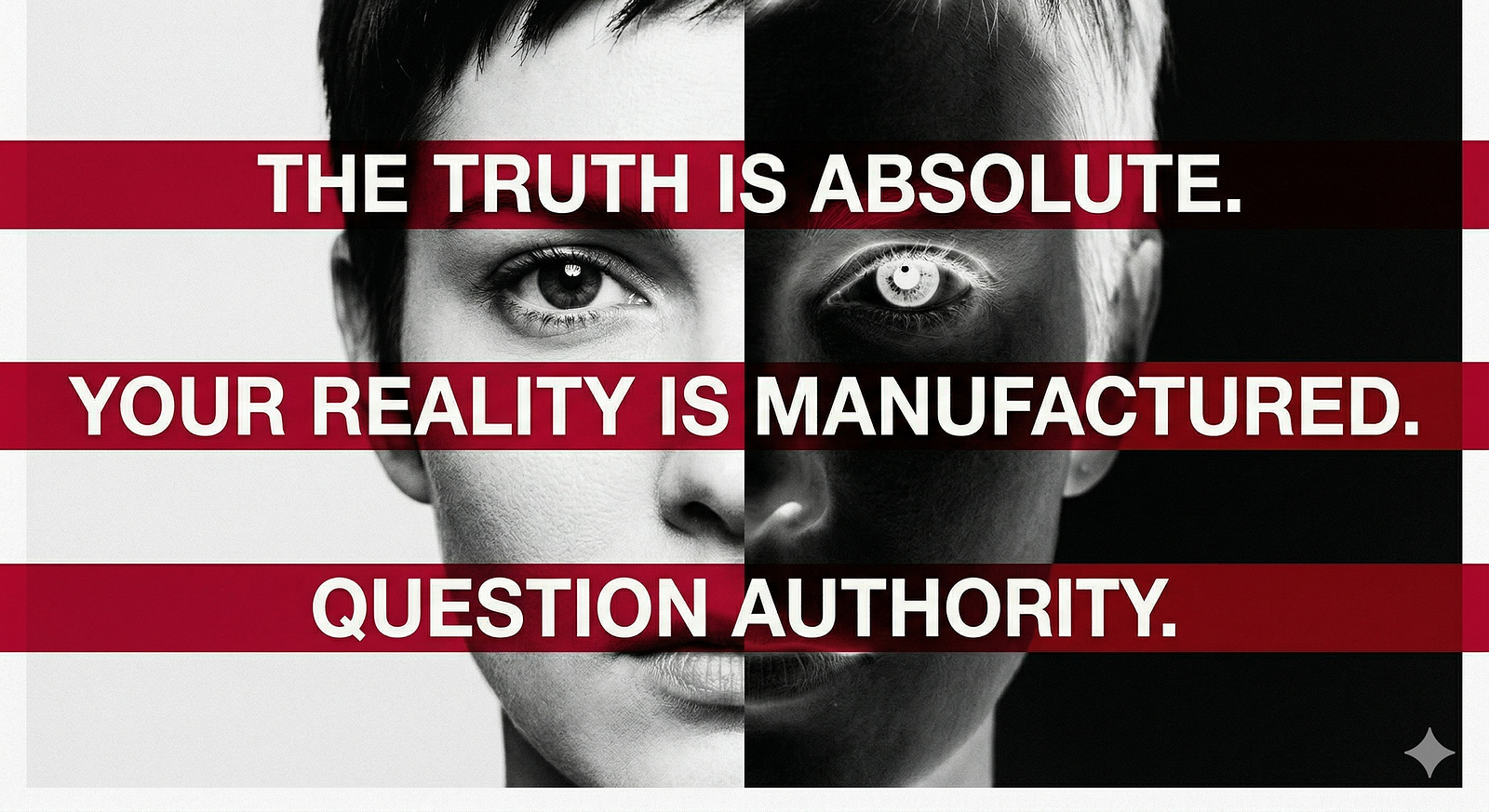
Art Prompt (Conceptual Pop): A stark, confrontational close-up portrait of a poised face rendered in crisp black-and-white photography, split vertically so one half appears in normal tones and the other in inverted negative tones. Across the image, place bold horizontal crimson bands carrying short white sans-serif statements, sharp and declarative, with immaculate editorial spacing. The composition should feel like a luxury magazine cover hijacked by a political protest poster. High contrast, severe cropping, immaculate print texture, clean margins, no decorative clutter, only face, text bars, tension, and authority. The mood should be intellectually aggressive, stylish, and unsettlingly direct.
Video Prompt: Begin with a rapid zoom into a monochrome face as the frame splits into positive and negative halves. Bold red text bands slide in from different directions with sharp kinetic typography, locking across the eyes, mouth, and throat in beat-synced bursts. Add subtle paper grain, poster paste texture, and flashes of tabloid-style cropping as the camera punches in and out. Let the face hold almost perfectly still while the text bars and tonal inversion do the drama. Use quick freezes, assertive snap-cuts, and a final hard stop on a full-frame stare that feels like the image has just accused the viewer of something accurate.

Songs to Pair With It:
- Hyperballad — Bjork
- Destroy Everything You Touch — Ladytron