
If painting had a “do not disturb” mode, it would look like a Rothko: vast, hovering fields of color that mute the world and crank your interior volume to 11. That’s the trick — almost nothing “happens,” yet somehow everything happens.
Who is this artist? Born Marcus Rothkowitz in 1903 (in what is now Daugavpils, Latvia), he emigrated to the U.S. at age ten and eventually became one of the central figures of postwar American art. His bio has Yale detours, New York hustle, and a relentless search for a language beyond pictures. The National Gallery of Art has a crisp origin story if you like your facts neat and verifiable: NGA biography.
What is he known for? Those enveloping rectangles — soft-edged, stacked bands of color that seem to float and breathe. He wanted them to make you feel basic human emotions: tragedy, ecstasy, doom, the whole playlist. MoMA keeps his greatest hits well lit: MoMA artist page.

What is his style? Filed under Abstract Expressionism, subfolder “Color Field.” Big, luminous, meditative canvases designed to be experienced up close, like you’re stepping into a weather system of color. If you want a tidy movement overview, The Art Story on Color Field connects the dots without killing the vibe.
Who taught him? Rothko wasn’t a single-mentor prodigy; he learned in New York’s ferment — classes at the Art Students League, exposure to European modernism, friendships and frictions with fellow painters. The short version: his real teacher was the question, “What can painting feel like if it stops telling stories?”
Does he use any special technique? Yes — layered, thinned paint built up in veils, with edges feathered so color hums where zones meet. He often worked wet-on-wet, letting underlayers glow through, and favored vertical formats that read like portals. MoMA’s gallery note summarizes that arc from fiery reds to late darks: “403: Mark Rothko” gallery text.

Who has he worked with? “Collaboration” isn’t the word — he’s more cathedral-builder than bandmate — but patrons and patrons-with-architecture mattered. Exhibit A: the Houston sanctuary now synonymous with his name. The unfolding story is here: Rothko Chapel timeline.
Was he wealthy? Eventually successful, yes; serenely rich, no. He turned down lucrative situations if they compromised the experience he wanted. Case in point: he famously walked away from a posh commission for the Four Seasons Restaurant and redirected those murals to public collections. Tate’s writeup is the perfect pit stop: Seagram Murals at Tate Modern.
When was he most popular? Late 1940s through the 1960s. That’s when the rectangles stabilized, the scale grew, and museums started building rooms just to let the work do what it does — press pause on your nervous system.

Tell me more, please. He didn’t want “pretty.” He wanted presence. Light soaks the canvas from behind (thanks to those thin glazes), edges pulse, and your brain supplies the movement. Stand close and the painting stops being a picture and starts being a place.
Anything else left to tell? The chapel. Fourteen near-black panels arranged for contemplation — no labels, no distractions, just the slow thunder of color. It’s a rare site where art and silence co-author the experience: Rothko Chapel.
Any other interesting tidbits? Rothko arranged the hanging height carefully — he wanted the rectangles to meet your body, not tower over it. He also preferred low light. The room becomes the dimmer switch; your perception does the rest.
How to See Like Rothko (Without Squinting)
- Walk up until your peripheral vision touches the edges.
- Breathe slower than you think you should.
- Wait. (You’re not “looking at” a Rothko; you’re letting it land.)

Want to Go Deeper?
- NGA biography — life, letters, and early work with figures.
- MoMA artist page — collection overview and quote gold.
- The Art Story on Color Field — movement context in plain English.
- Seagram Murals at Tate Modern — the commission he rejected, the legend that followed.
- Rothko Chapel timeline — how a painting becomes a room becomes a pilgrimage.
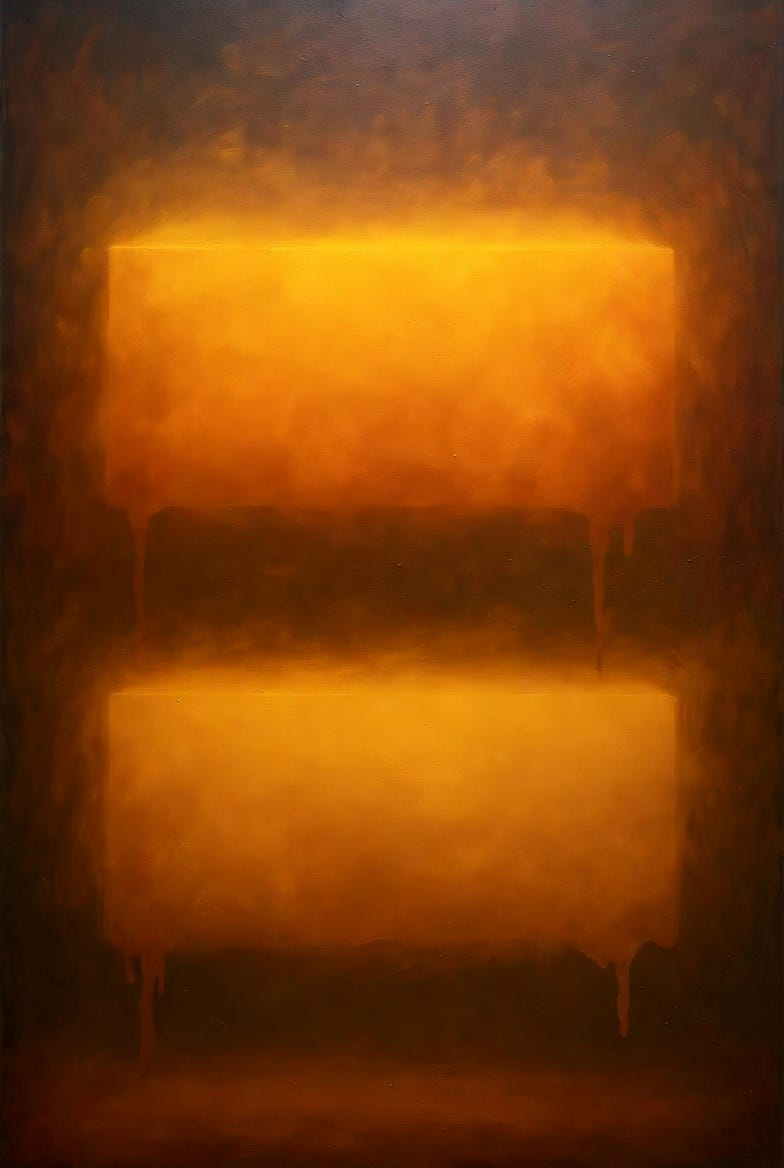
Art Prompt (Color Field): Monumental vertical canvas divided into two soft rectangles that hover like fog banks — top a luminous saffron plateau, bottom a deep apricot field — both with feathered, glowing edges that bleed into a warm, honeyed ground; dozens of translucent glazes create a slow inner light; surface shows faint brush-lap seams and whispery drips at the margins; atmosphere hushed, devotional, and airless; composition simple but weighty, with the lower bar slightly taller to anchor the eye; palette warm and radiant with tiny flickers of cool undertone peeking through; camera framing tight to the canvas so color fills everything; lighting dim, as if in a chapel; mood contemplative, time-dilated, and gently overwhelming.
Video Prompt: Begin with a slow dolly-in on a vertical field of color; two soft-edged rectangles — top saffron, bottom deep apricot — breathe subtly as translucent glazes ebb and flow. Edges shimmer with micro-flicker grain; a faint vignette darkens the corners. Add imperceptible parallax so the upper band drifts a hair forward, the lower settles back. Pace: glacial crossfades (8–12s), occasional pulse where the edges glow brighter, then exhale. Texture passes reveal ghostly brush seams and wispy drips at the margins. End with a near-black fade that leaves a residual afterimage.
Songs to pair with the video
- Requiem for Dying Mothers, Pt. 2 — Stars of the Lid
- My Only Swerving — El Ten Eleven

If this resonated, drop a comment with your favorite “quiet” artwork and hit follow so you don’t miss the next episode.